
Homecorp
'Beyond expectation'
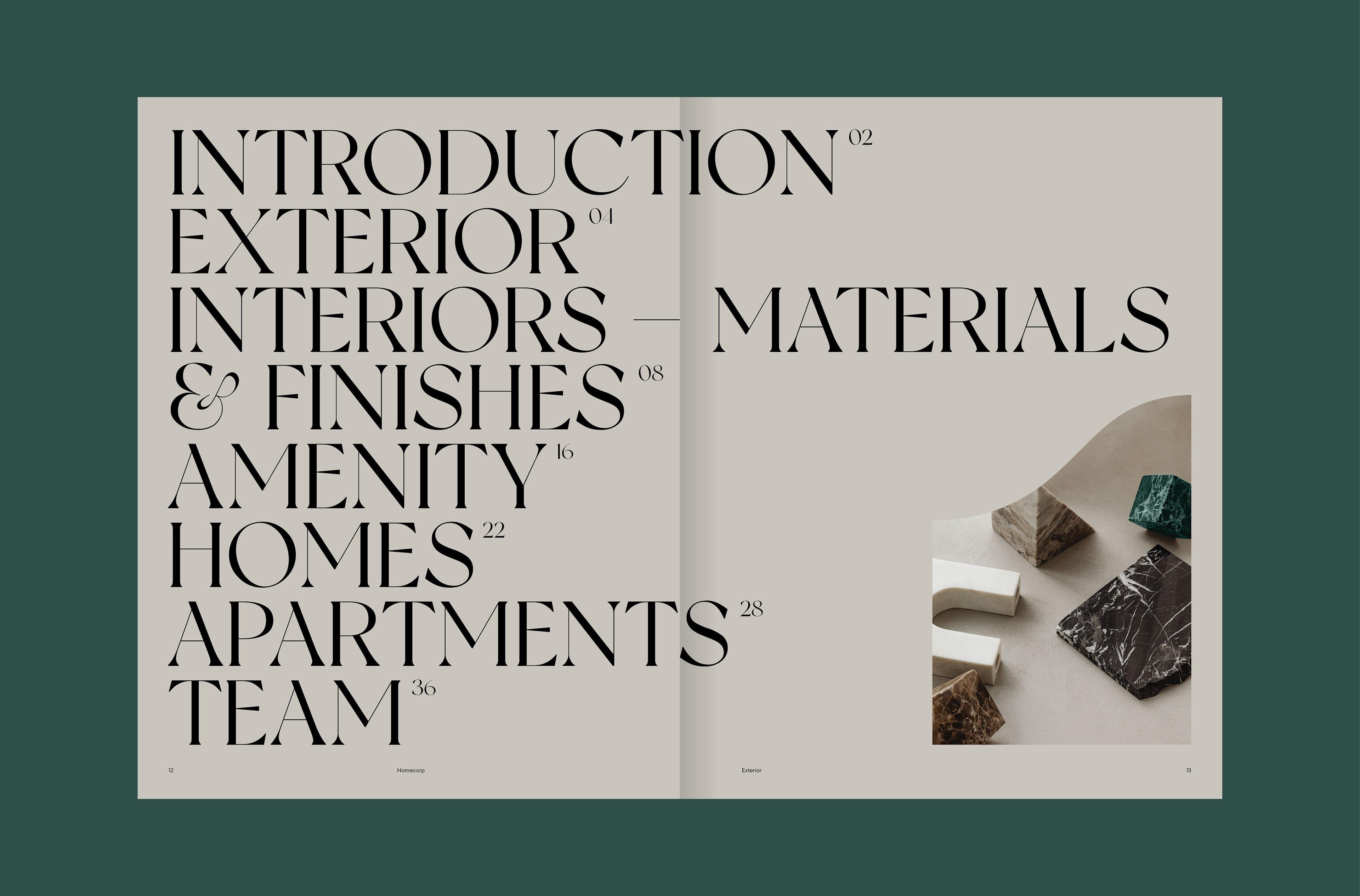
Brand identity, visual and verbal language, print and digital design
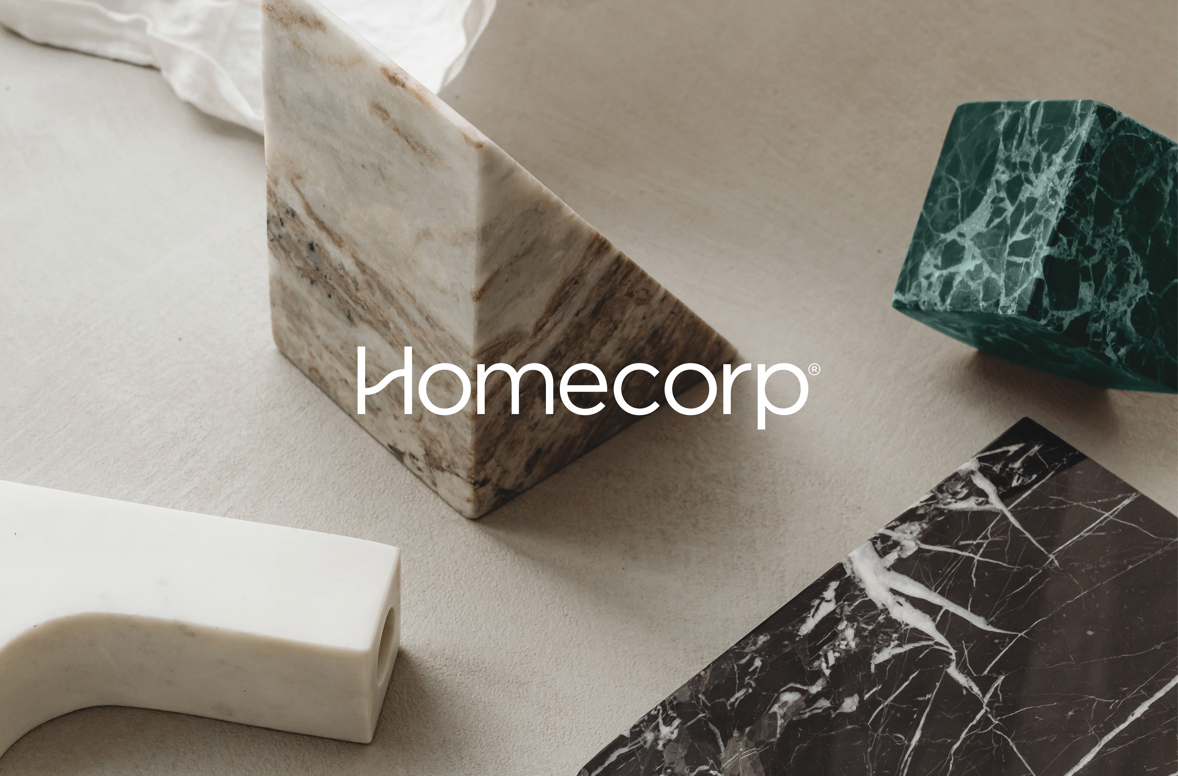
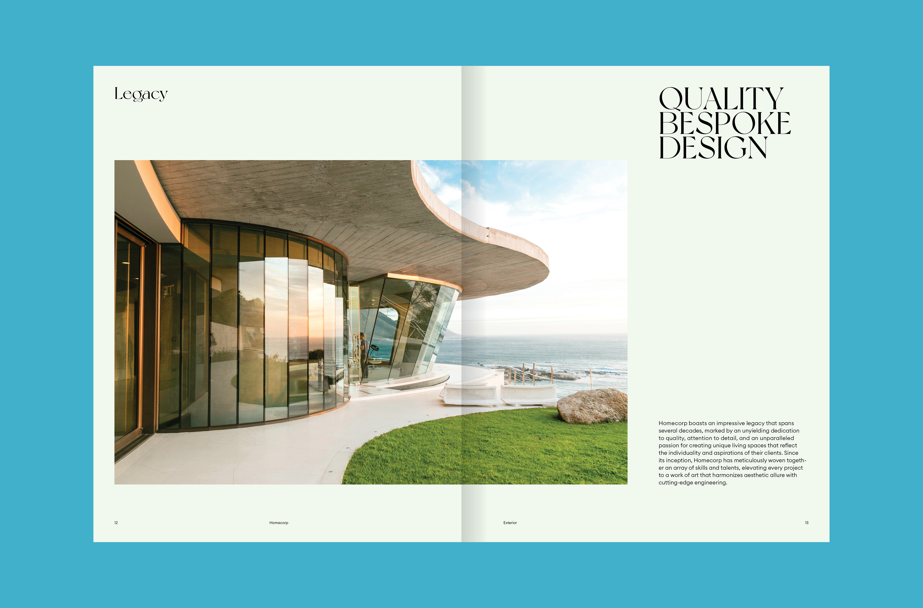
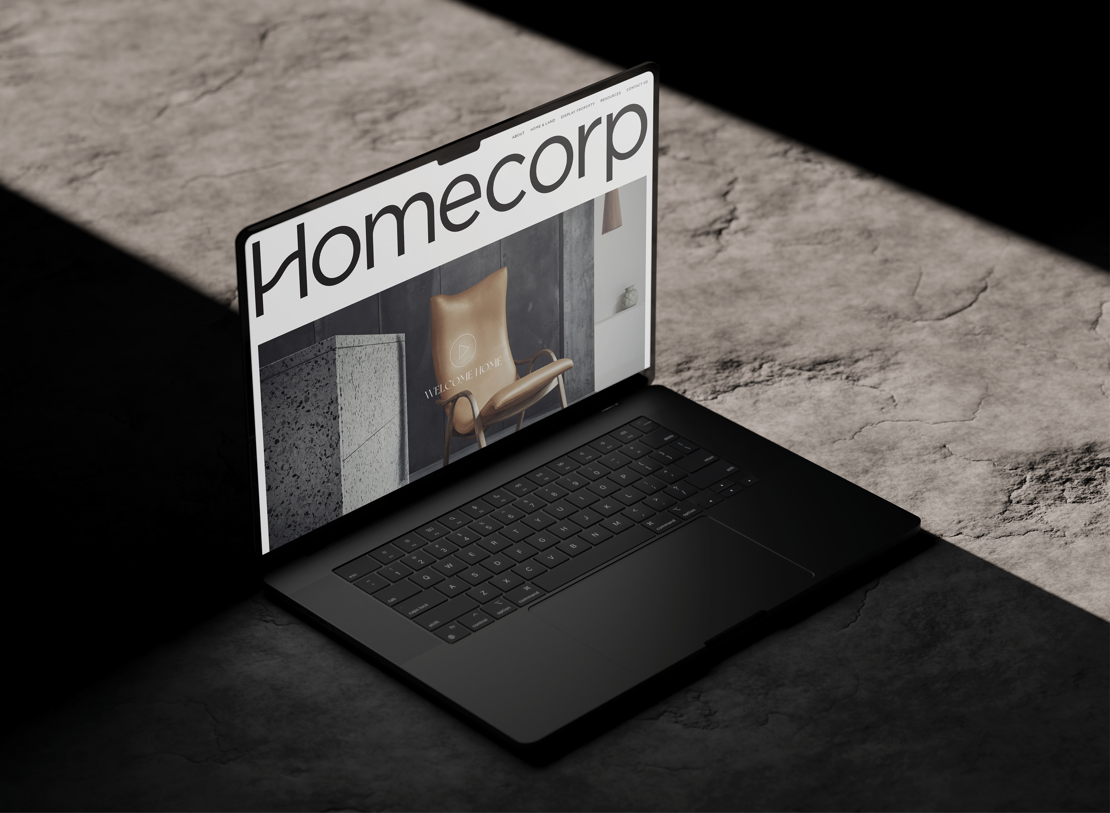
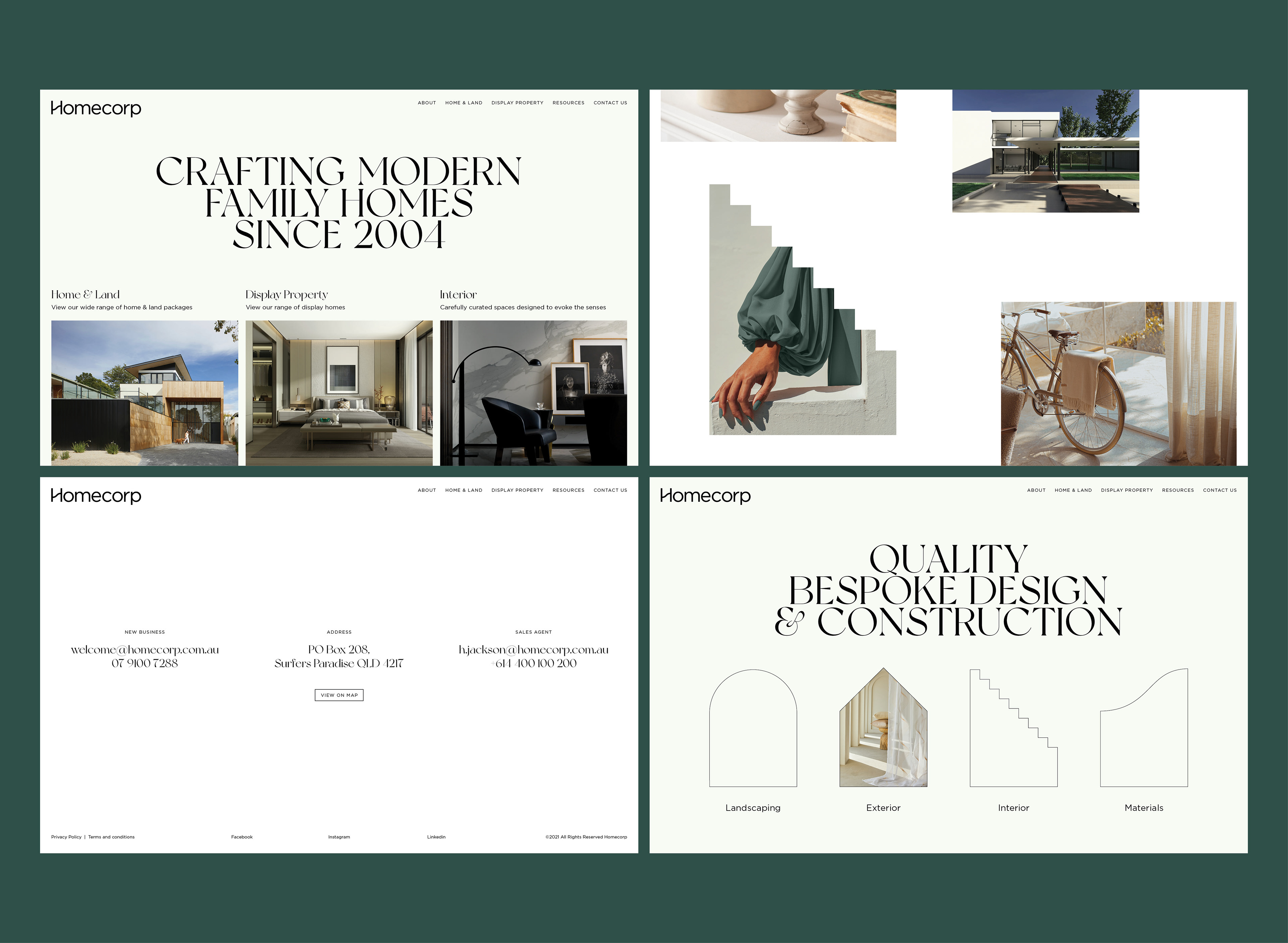
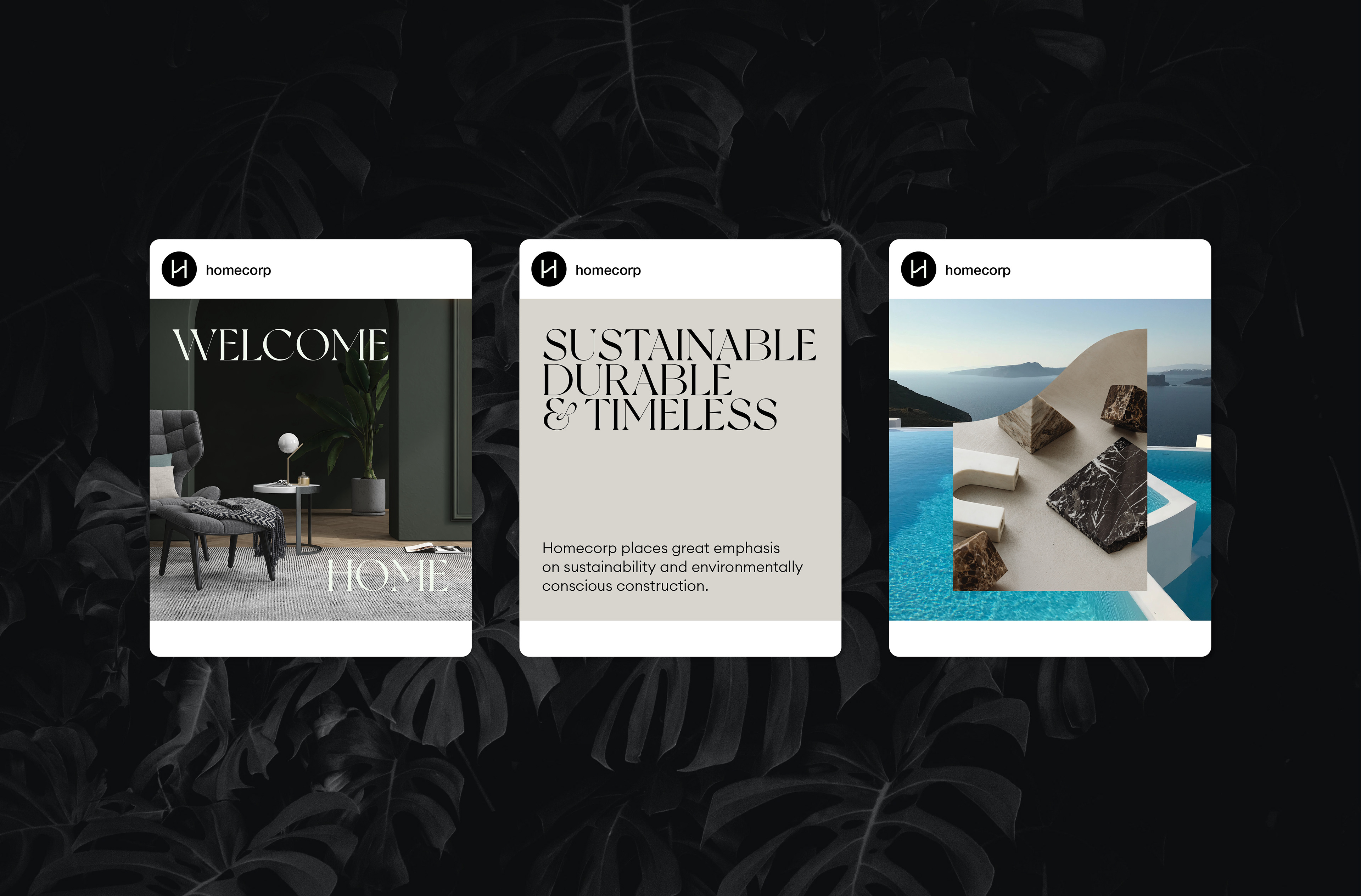
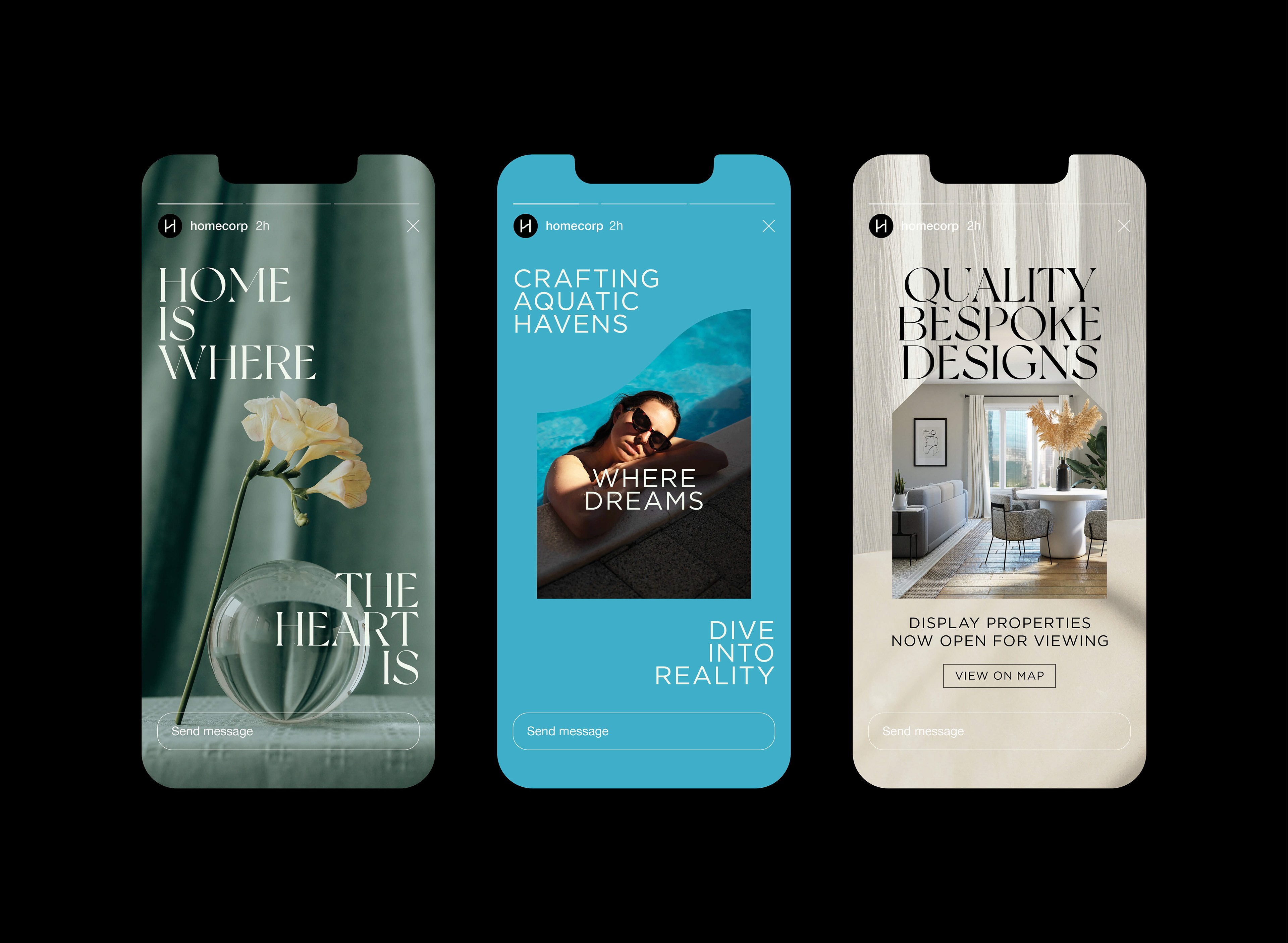
Homecorp required a brand refresh to solidify its position in the exclusive housing development market. Key words such as “Exclusivity” and “Beyond expectation” were the main points to consider as the personality of this new identity. Homecorp was characterised as the “Entrepreneurial Prince” of the development market, offering desirable lifestyle choices across a broad range of consumer types from singles, families right through to empty nesters.
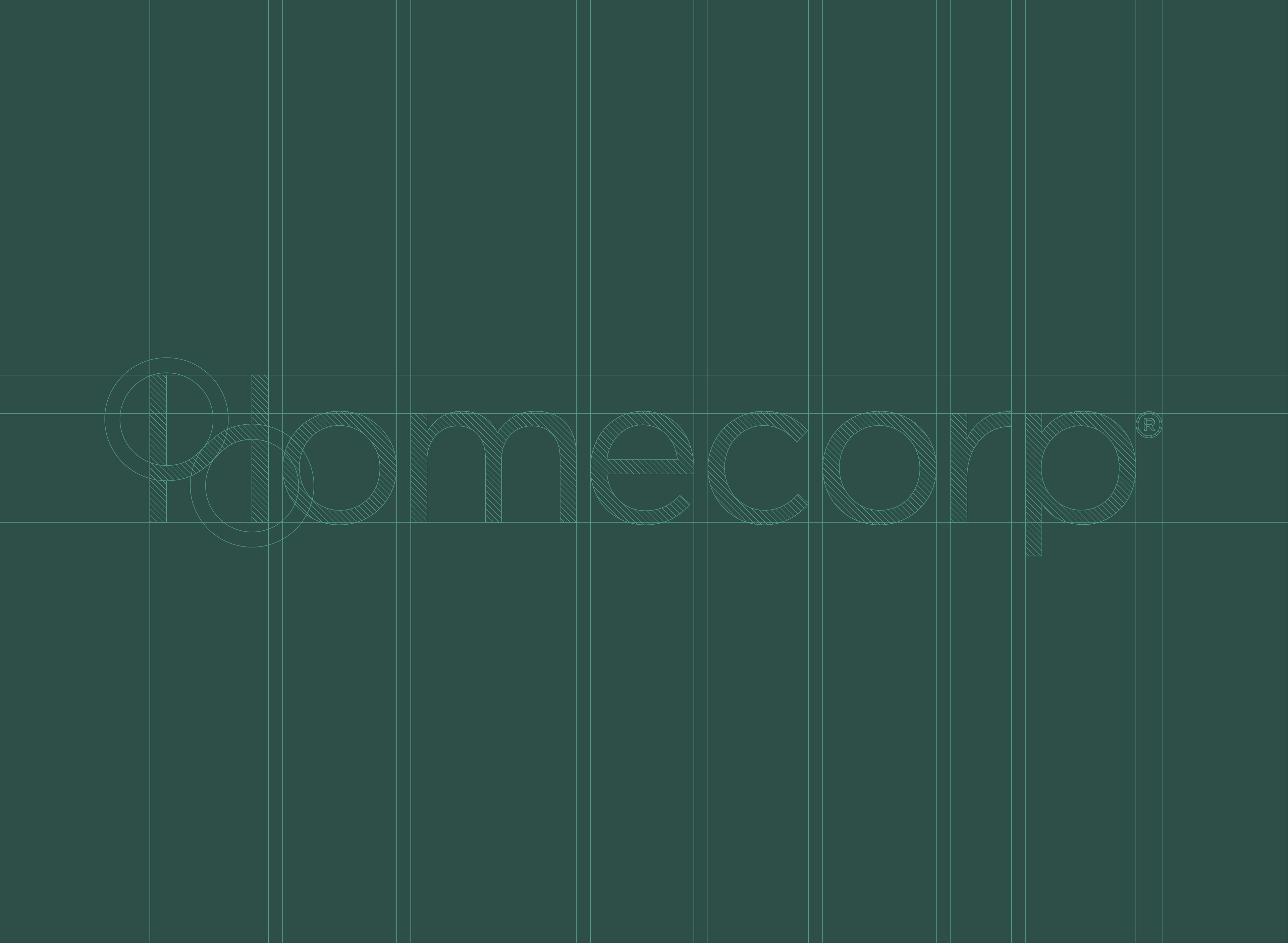
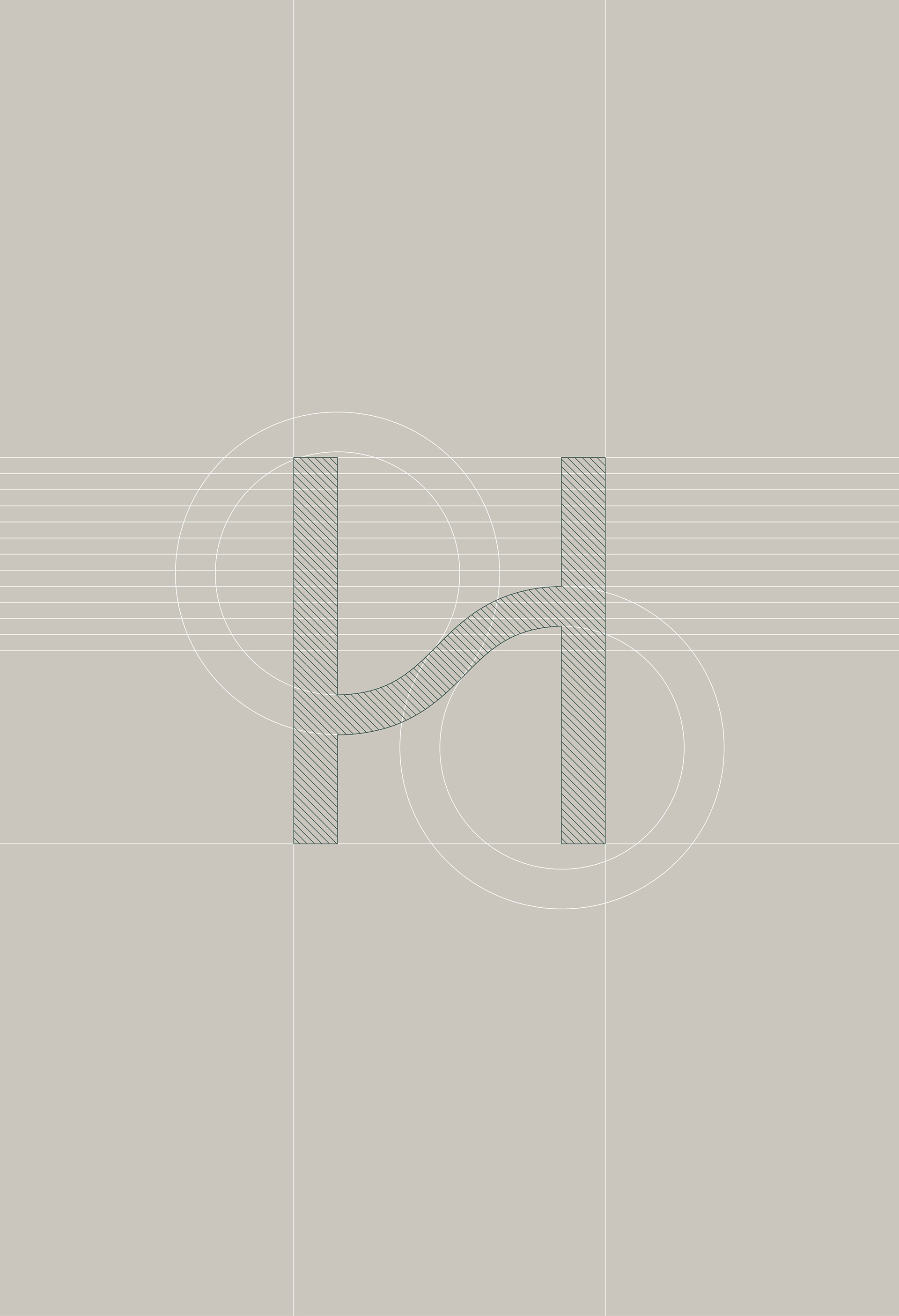
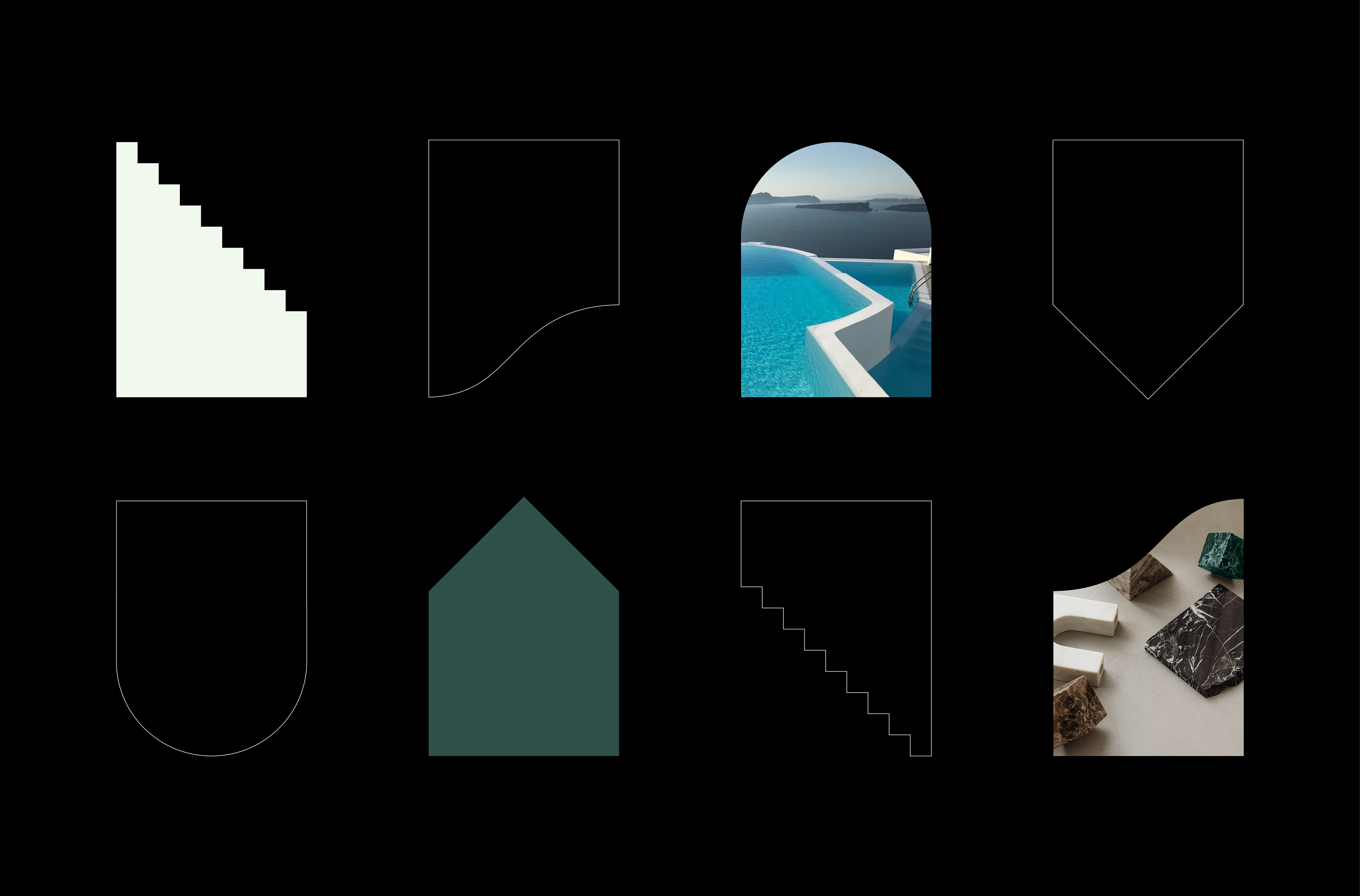
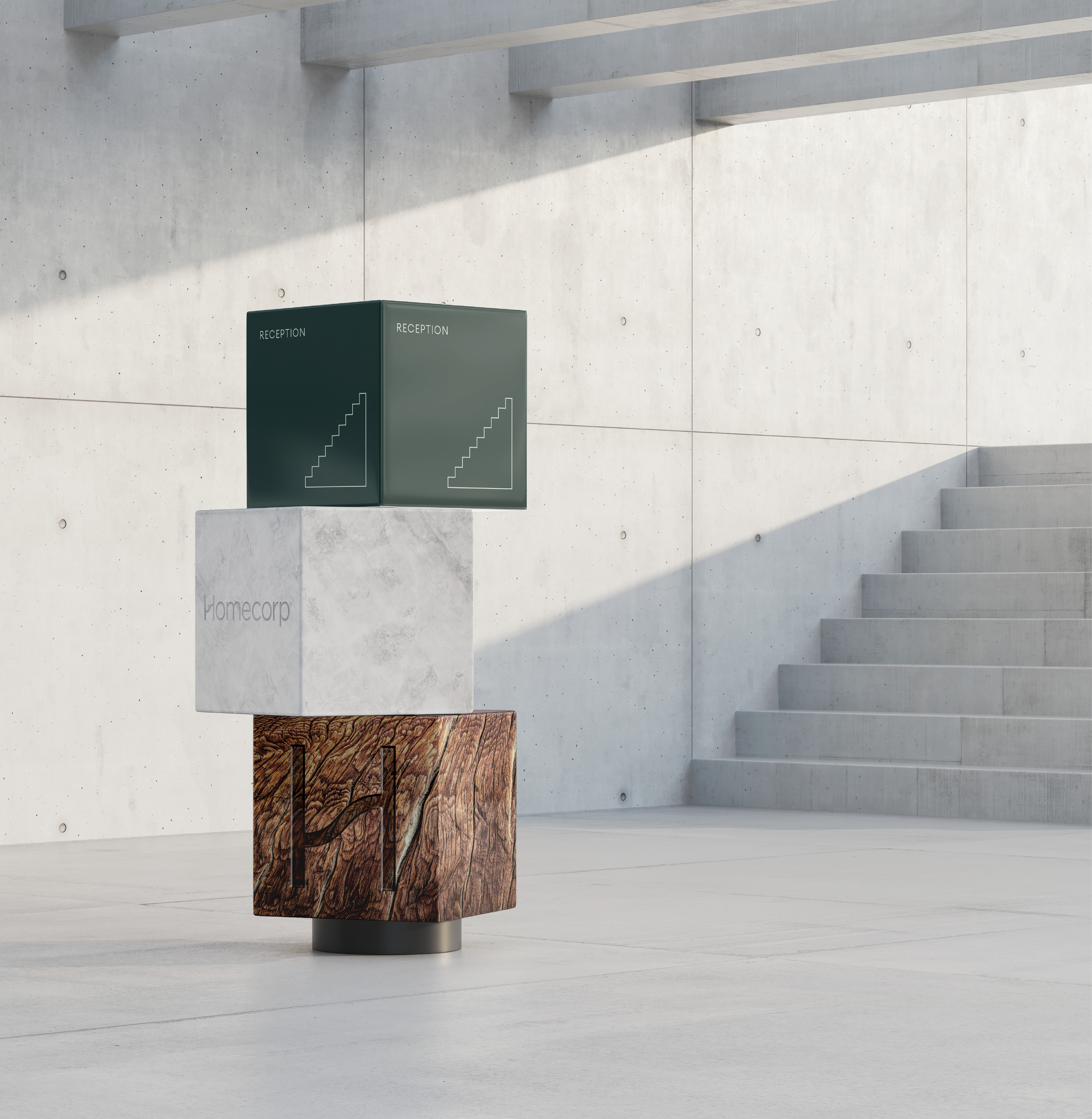
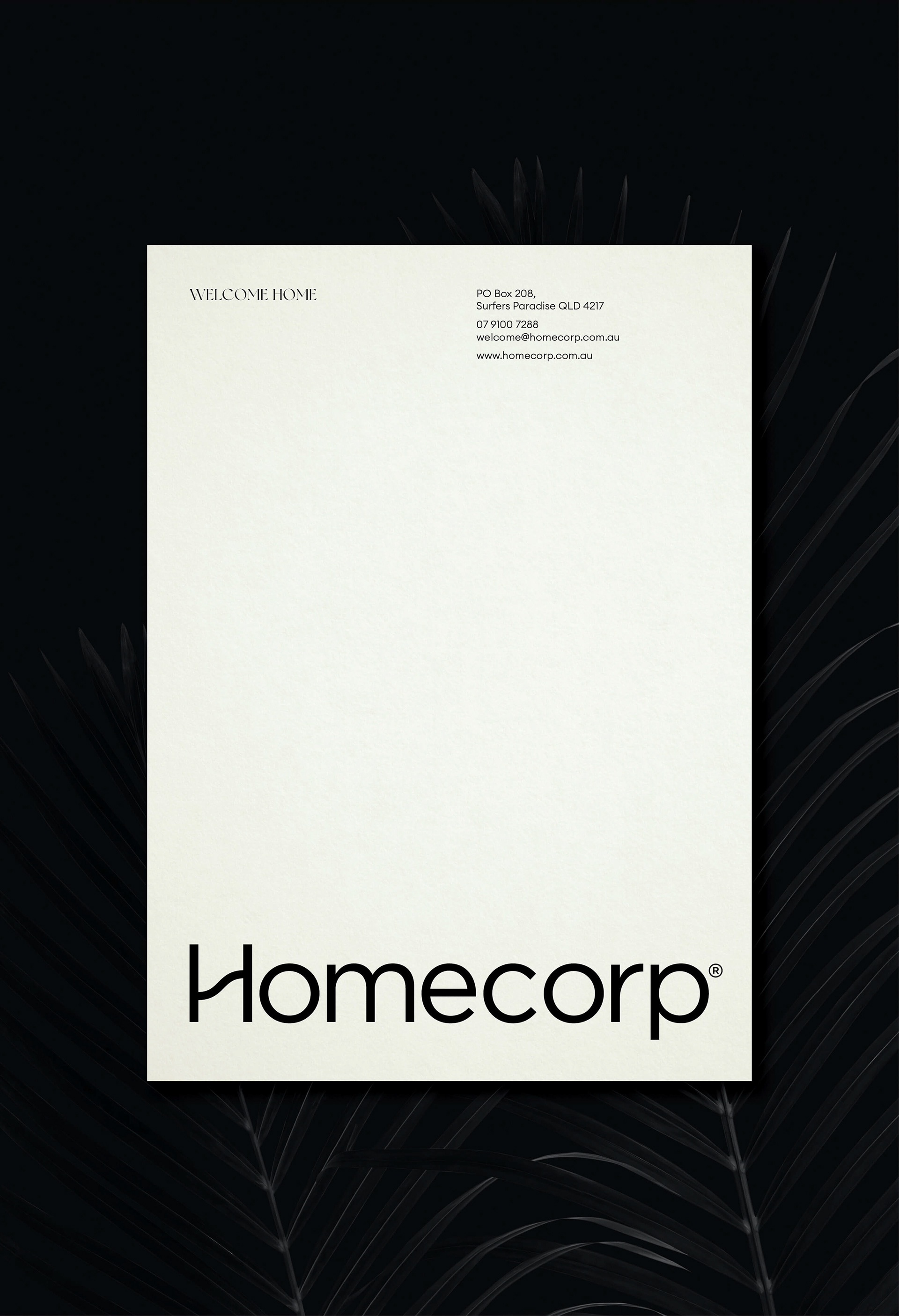
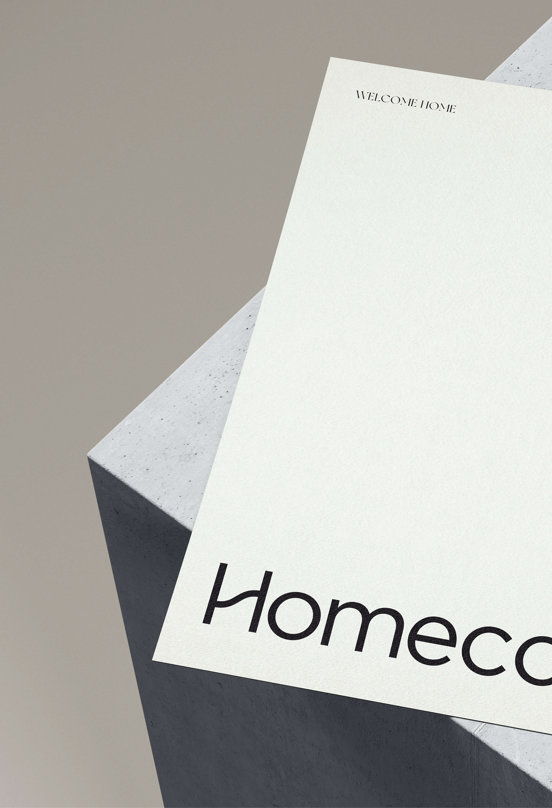
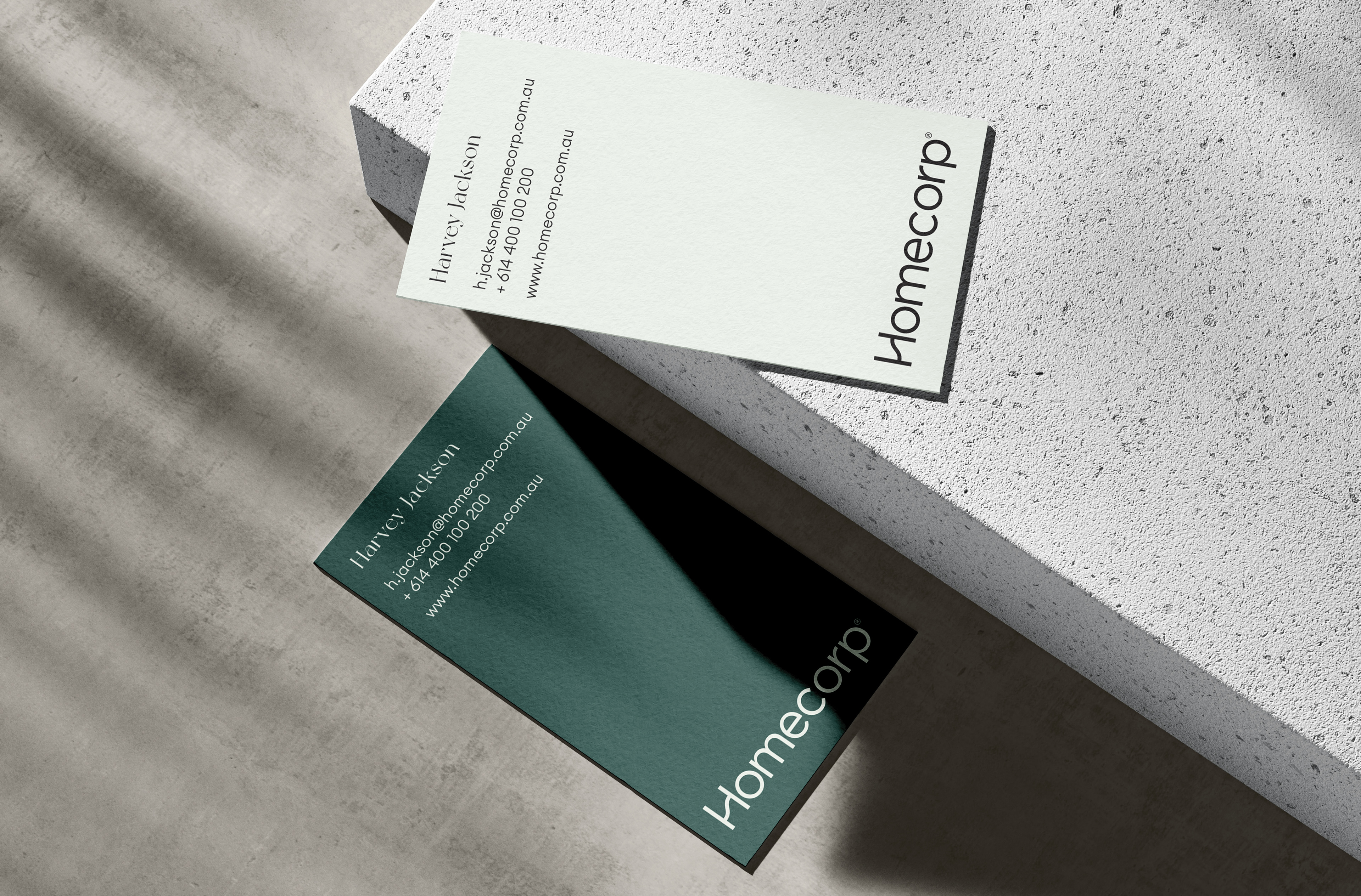
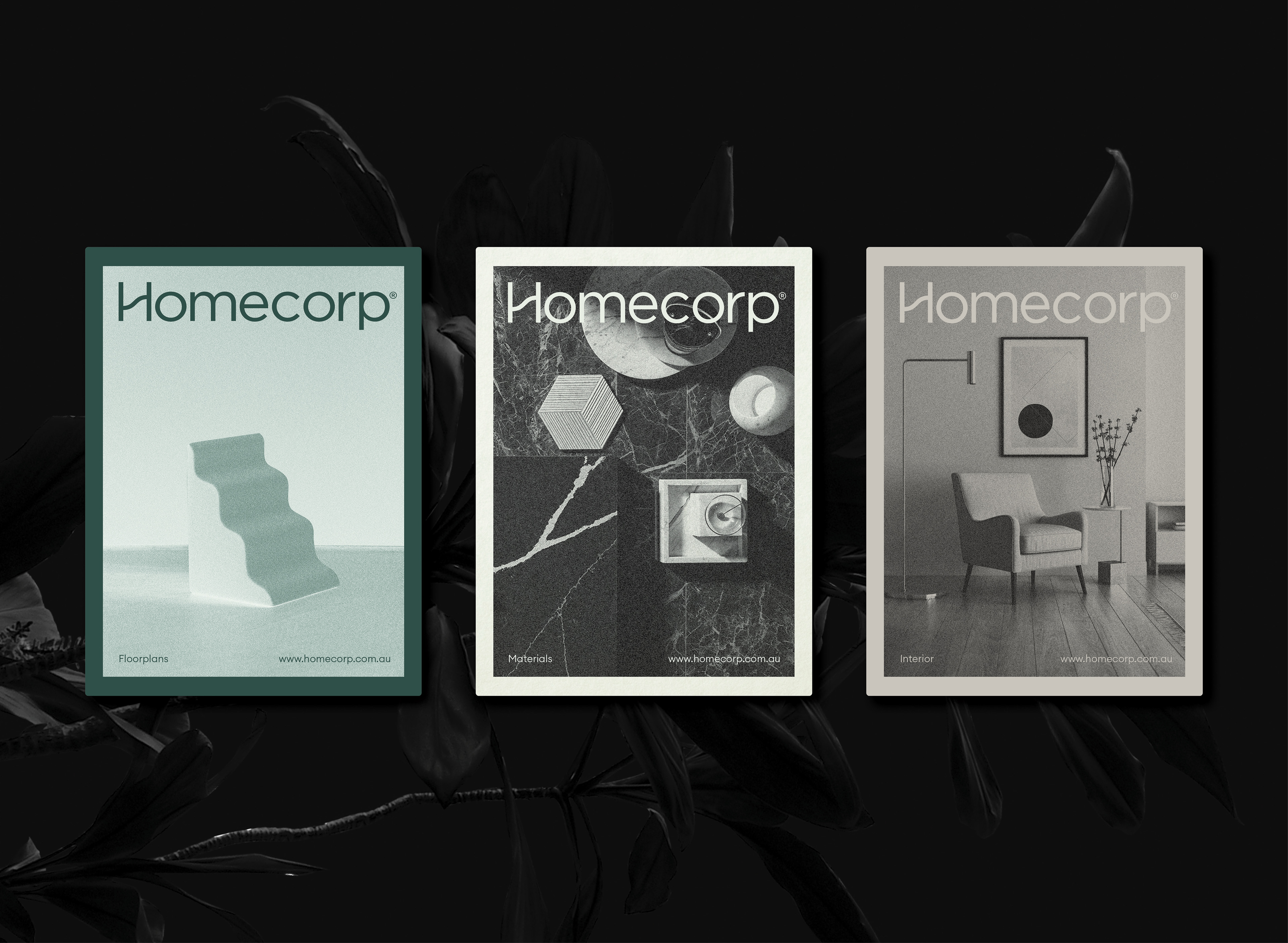
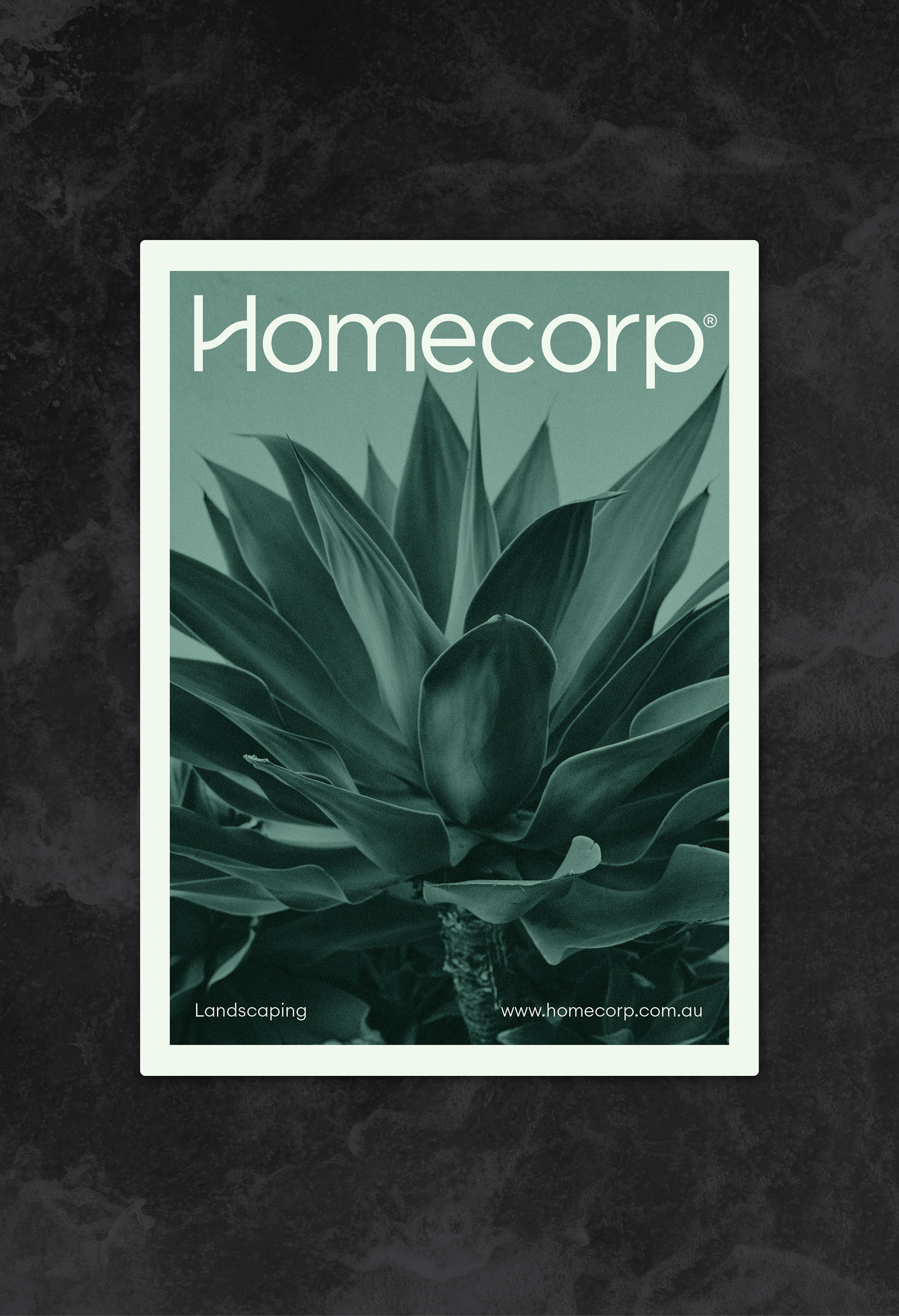
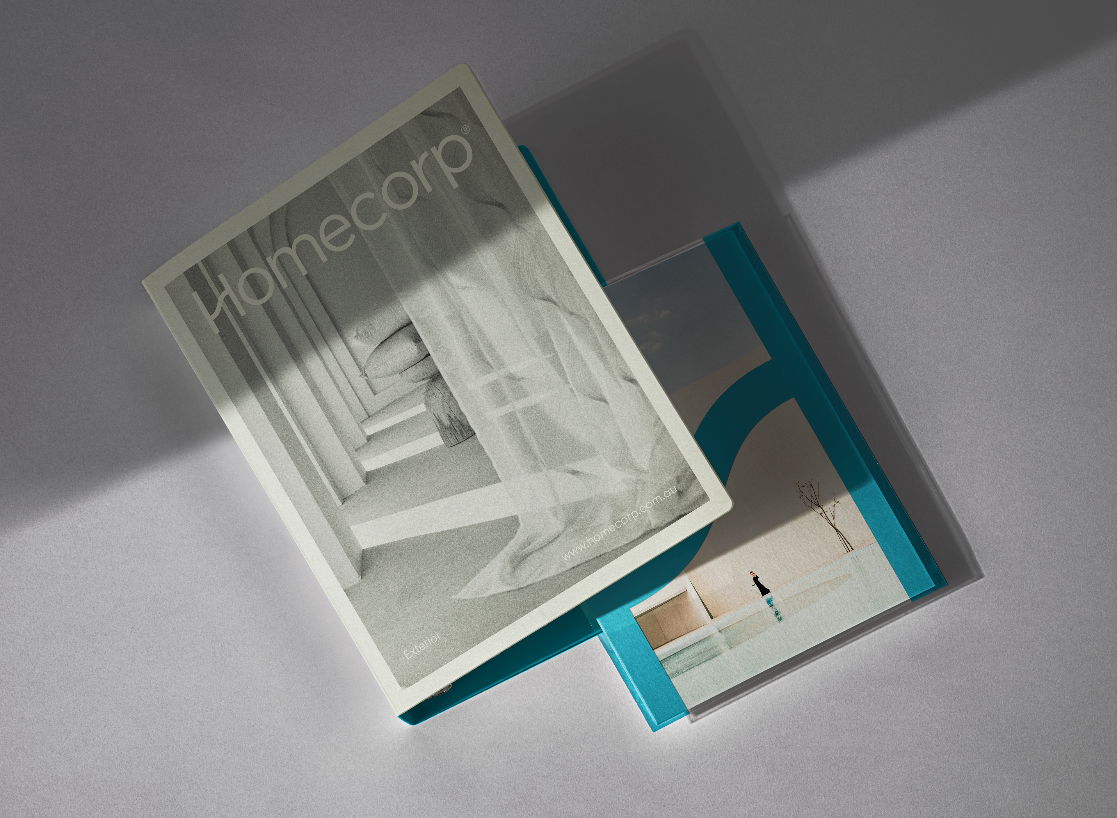
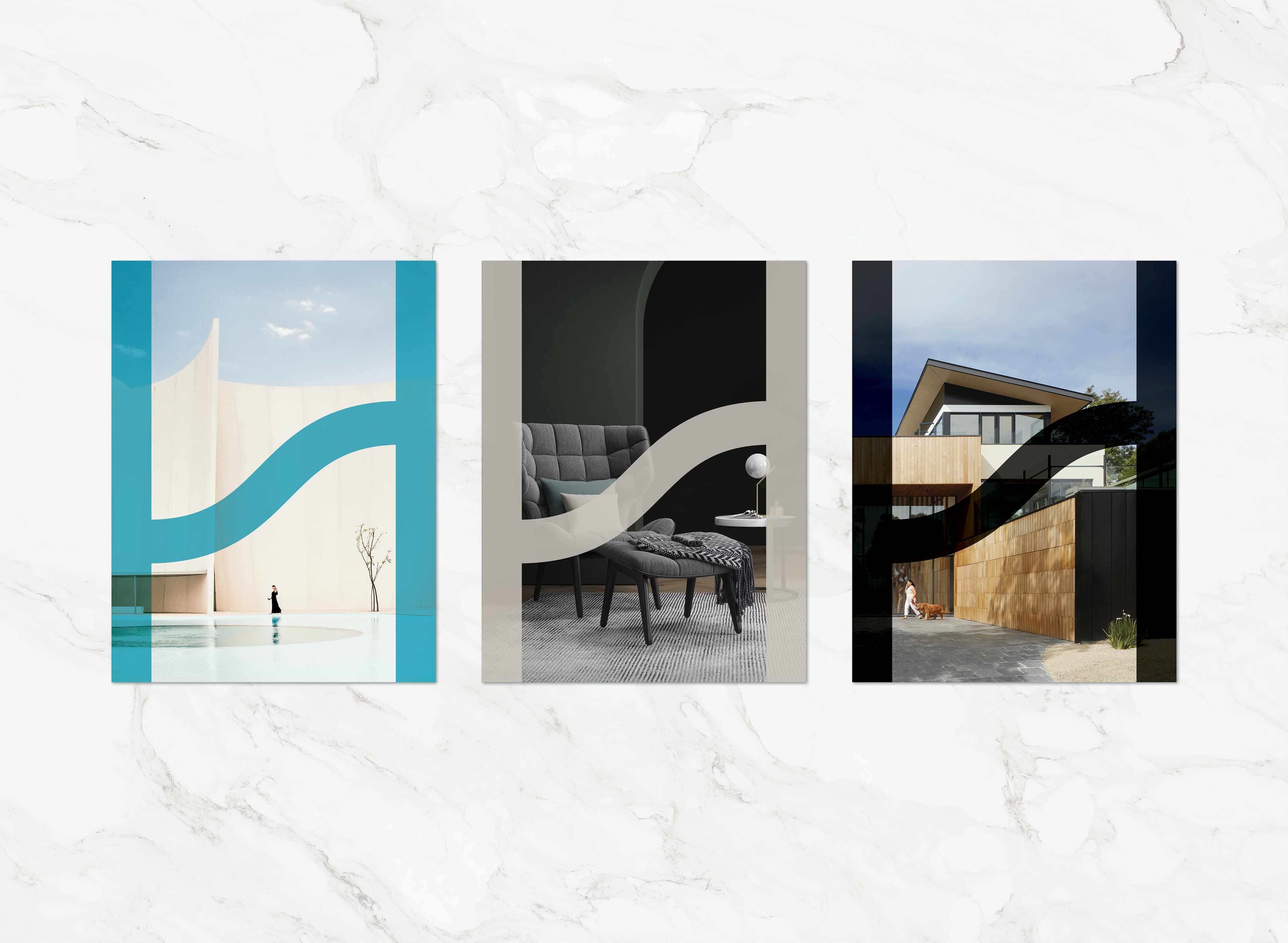
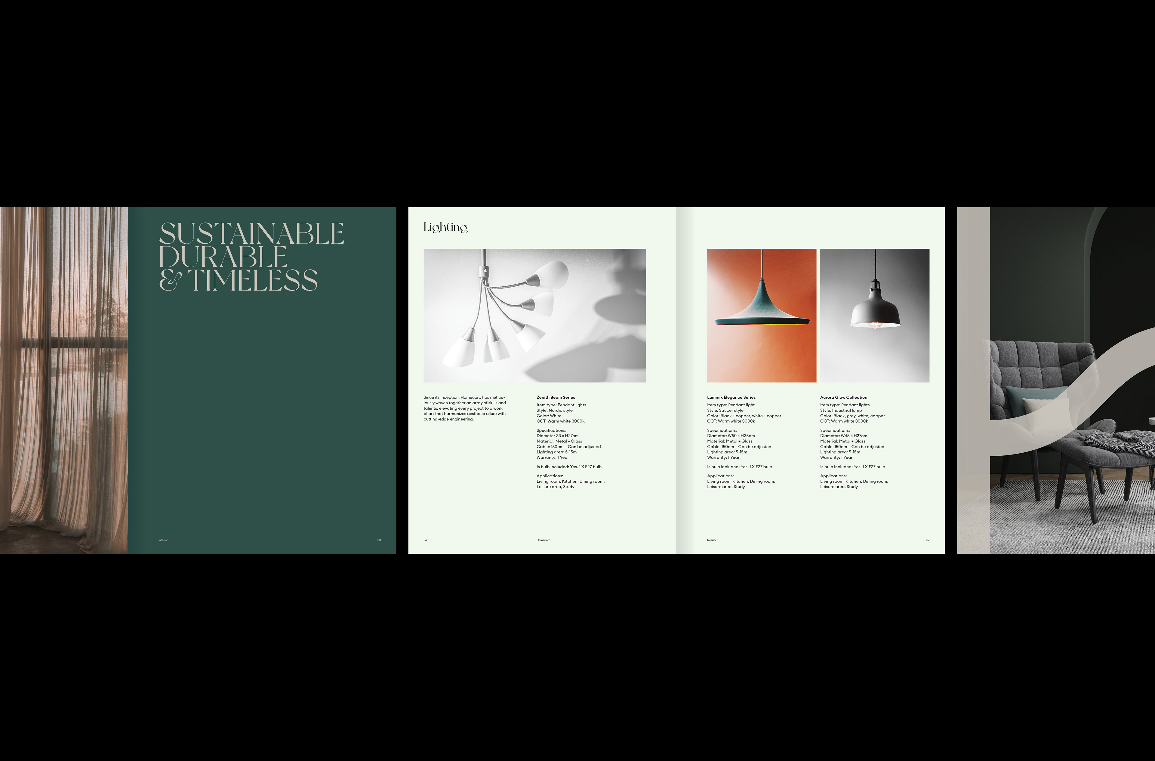
The logo was kept clean and uncluttered, with an upwards inflection within the “H” symbolising the notion of going beyond expectations. The new colour palette was inspired by desirable materials which convey the message of exclusivity, these are used thoughtfully and sparingly throughout Homecorp collateral. The identity required room for evolution as Homecorp will be entering the apartment development market in the near future.


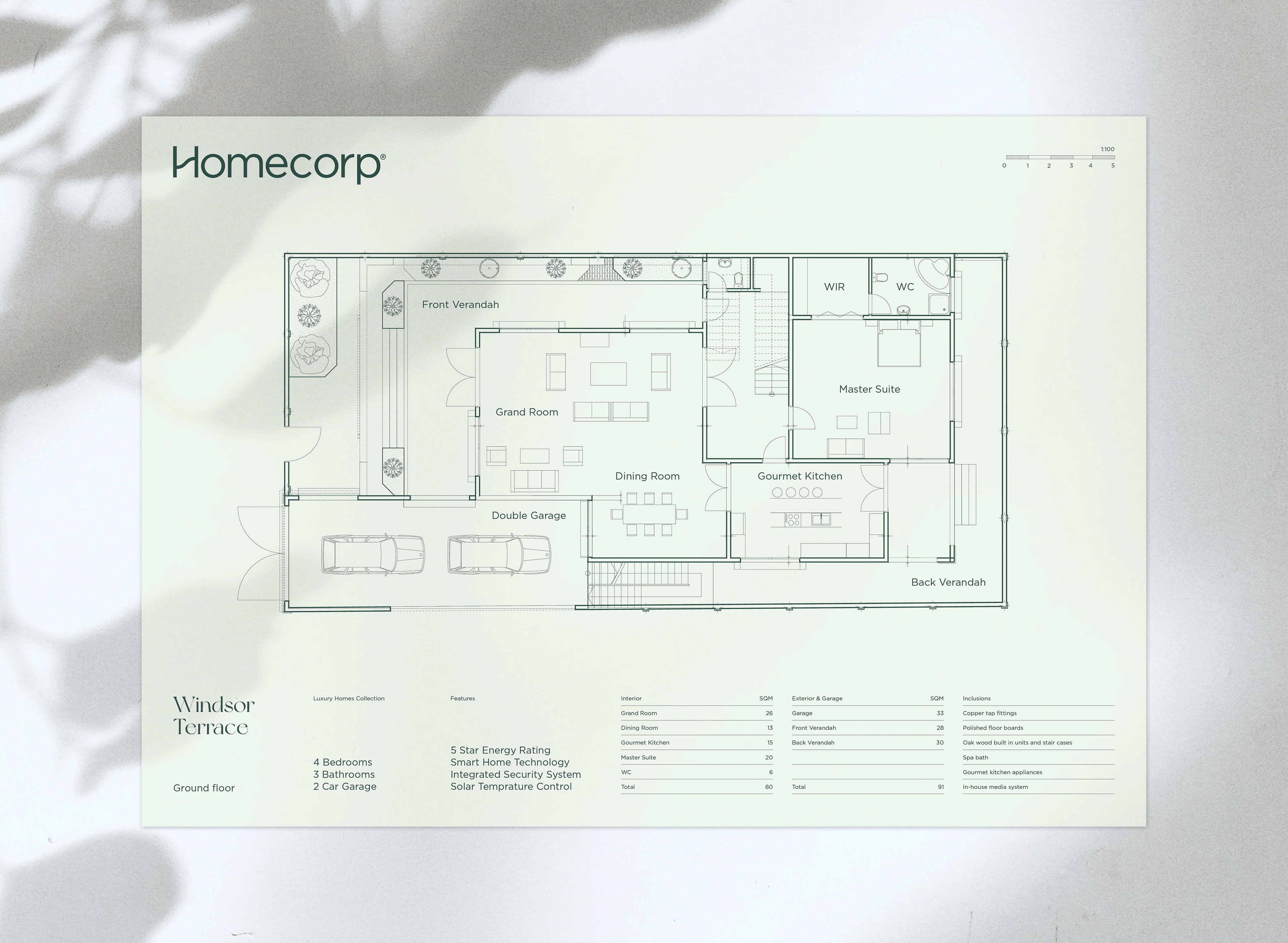


The artwork presented on this page does not express the legal views of the respective companies. The artwork is purely for graphic representation, some elements
of the artwork have changed throughout the entirety of the creative process. Some projects have not been completed therefore place holder information will be in use.
of the artwork have changed throughout the entirety of the creative process. Some projects have not been completed therefore place holder information will be in use.